

iOS / Web Clinical Data Platform
Restored morale, increased release cycles, and won international recognition, through inclusive discovery and testing while inventing new features, streamlining clinical data / workflows.
My Tasks
Software
Time / Team
Services
- Visualize new concepts and tools for the CEO
- Improve visual appeal and usability of an overly complex platform
- Increase usability, clarity, and efficacy of the data, while reducing data entry time
- Lower development costs, improve morale and increase capacity for innovation
- Assure clinical relevance, safety and accuracy of all components and processes
- Report all clinical research and usability test findings to the entire company
- Grow the UX team, assuring new hires can handle high-stakes design environment
- Adjust the data-density to make clinicians’ workflows more efficient, and simpler to use
- Review all Dev work for compliance with design standards before release
- Invent new features including e-prescribing, formulary sifting, patient visits, communications, delegation, reminders, and summaries
- Sketch
- Axure
- InVision
- Confluence
- Research & Testing
- UX Strategy
- Stakeholder Collaboration
- Process Improvement
- Design, Mobile First
- 2012-2014
- 1 Product Manager
- 4 Designers
- 2 QA leads
- 2 Engineers
- 1 CEO
- 50 Developers
My Actions
Vision
Worked closely with the CEO and Dir. of Product to establish vision and process.
Relationships
Built strong collaborative relationships with departmental team leads.
Discovery
Design
Test
Established the Continuous Discovery process and trained
Product / QA / Dev leads in the methodology to build their trust and ability to collaborate
in such a dynamic process.
Conducted over 450 interviews / reviews /
brainstorms with clinicians
(3 per week, every week, for 2.5 years).
Findings
Each continuous discovery session was followed by a debriefing session with team leads and then the ideas, pain points, reviews, ratings, and next steps were reported back to the rest of the company.
The original platform
- Looks circa 1985
- Painful to look at
- Doctors hated it

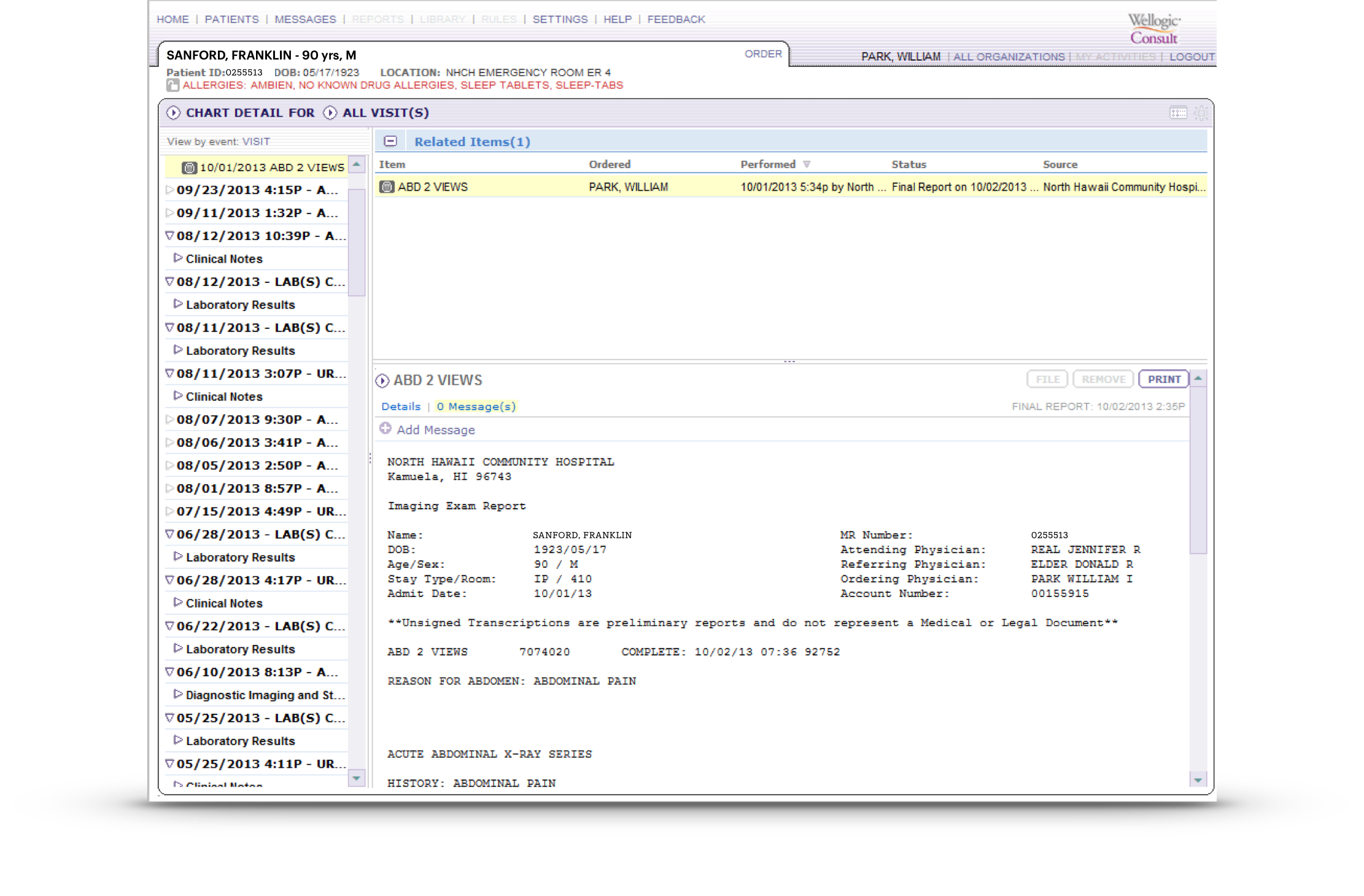
Key features are obscure
Lined background obscures text
Bold is over-used

Colors mean what?
Architecture-heavy
Click-targets too small for mobile
Over-reliance on borders

Dates occlude titles
Contextual data occludes primary data
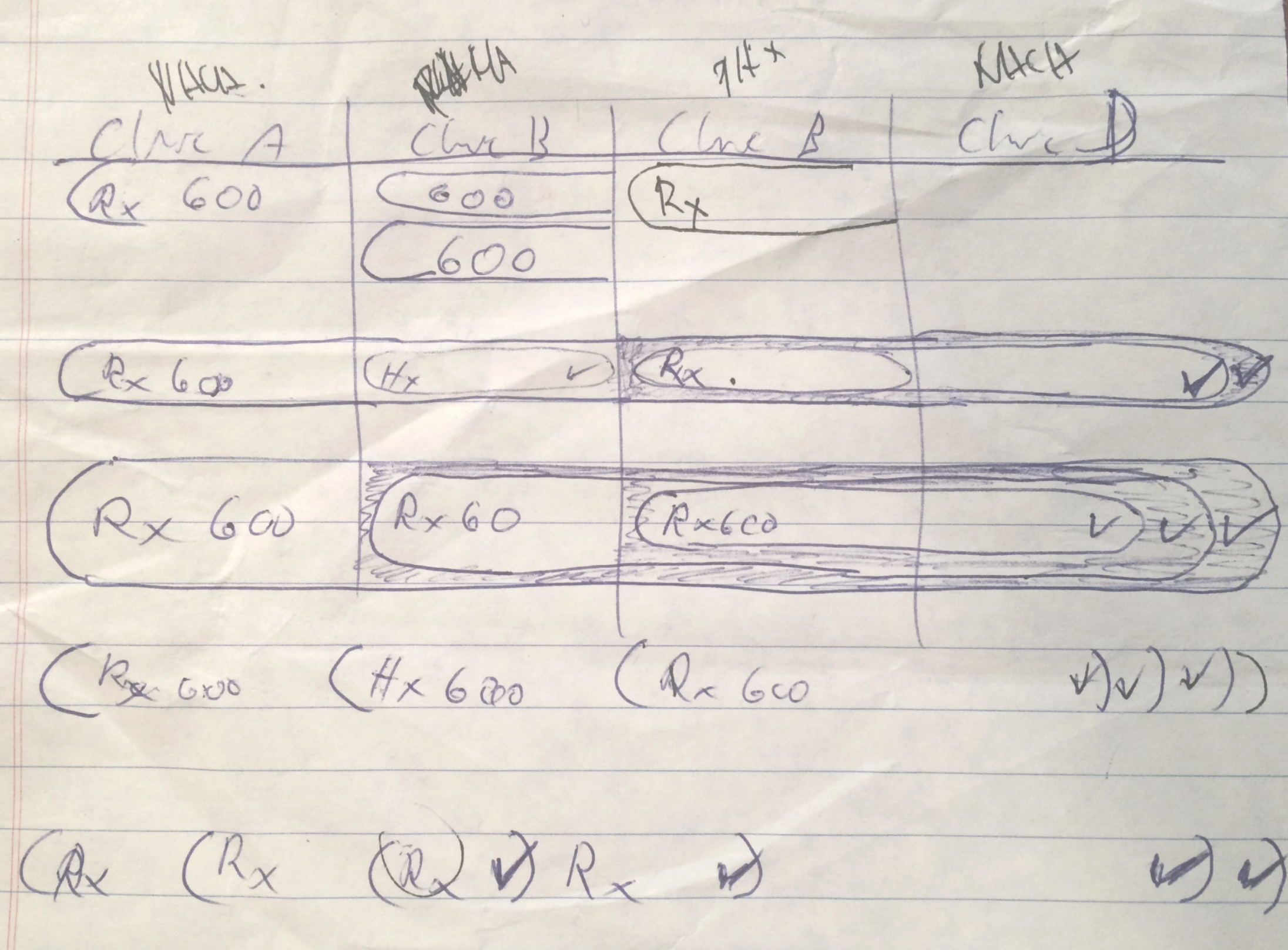
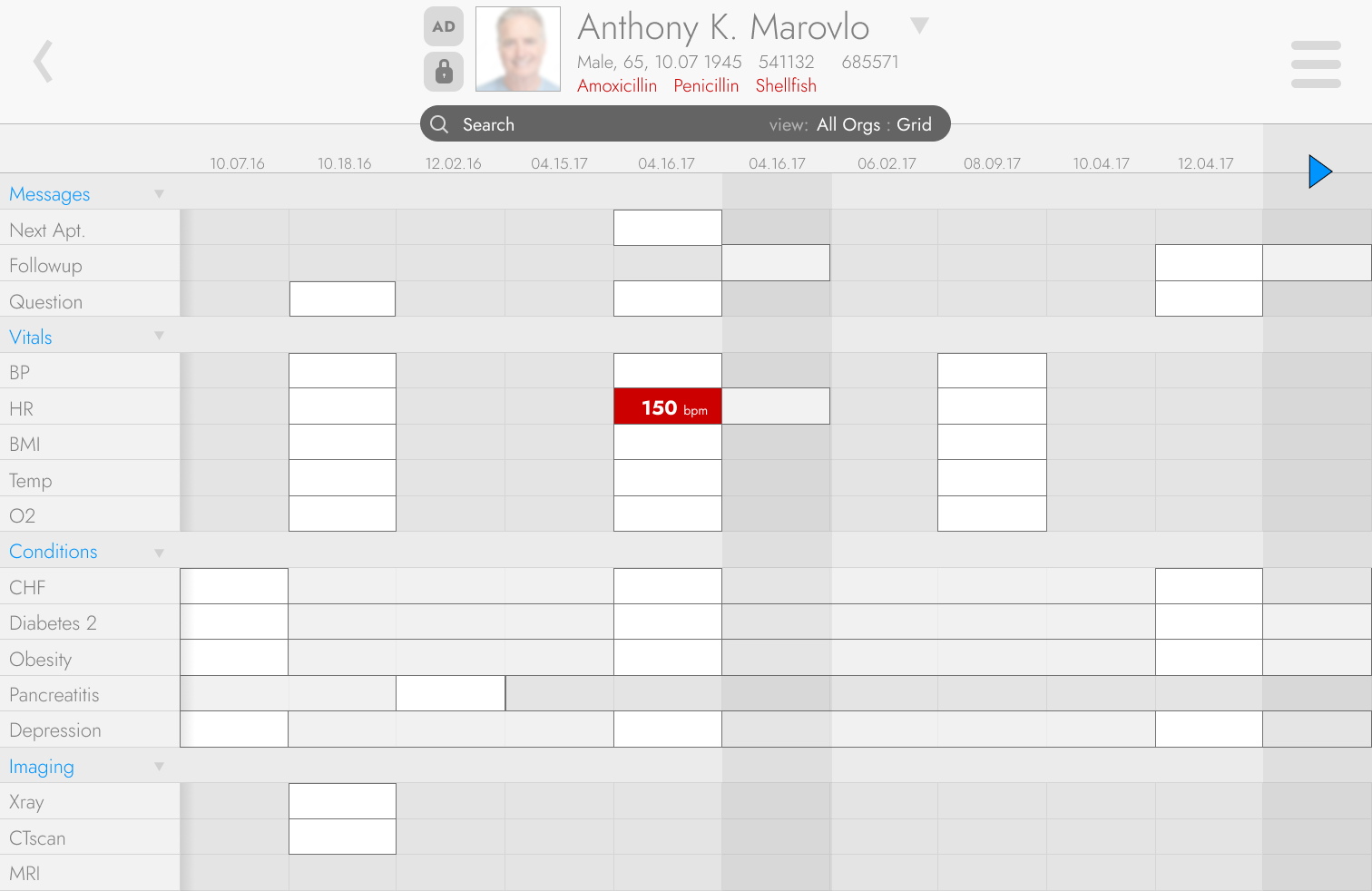
The CEO wanted the clinical data to be displayed in high-fidelity skeuomorphic spreadsheet so clinicians could see at a glance what was prescribed, when it was picked up, adjusted, or misused. A fine idea, but…

...once I mapped out every clinical case, context, type, variance, deviation, delay, adjustment, annotation, tapered dosage, compound variable, questionable source, edge case, contra-indication, alert, compliance issue, and fraudulent behavior, the spreadsheet would be so visually overwhelming that it would be effectively useless.
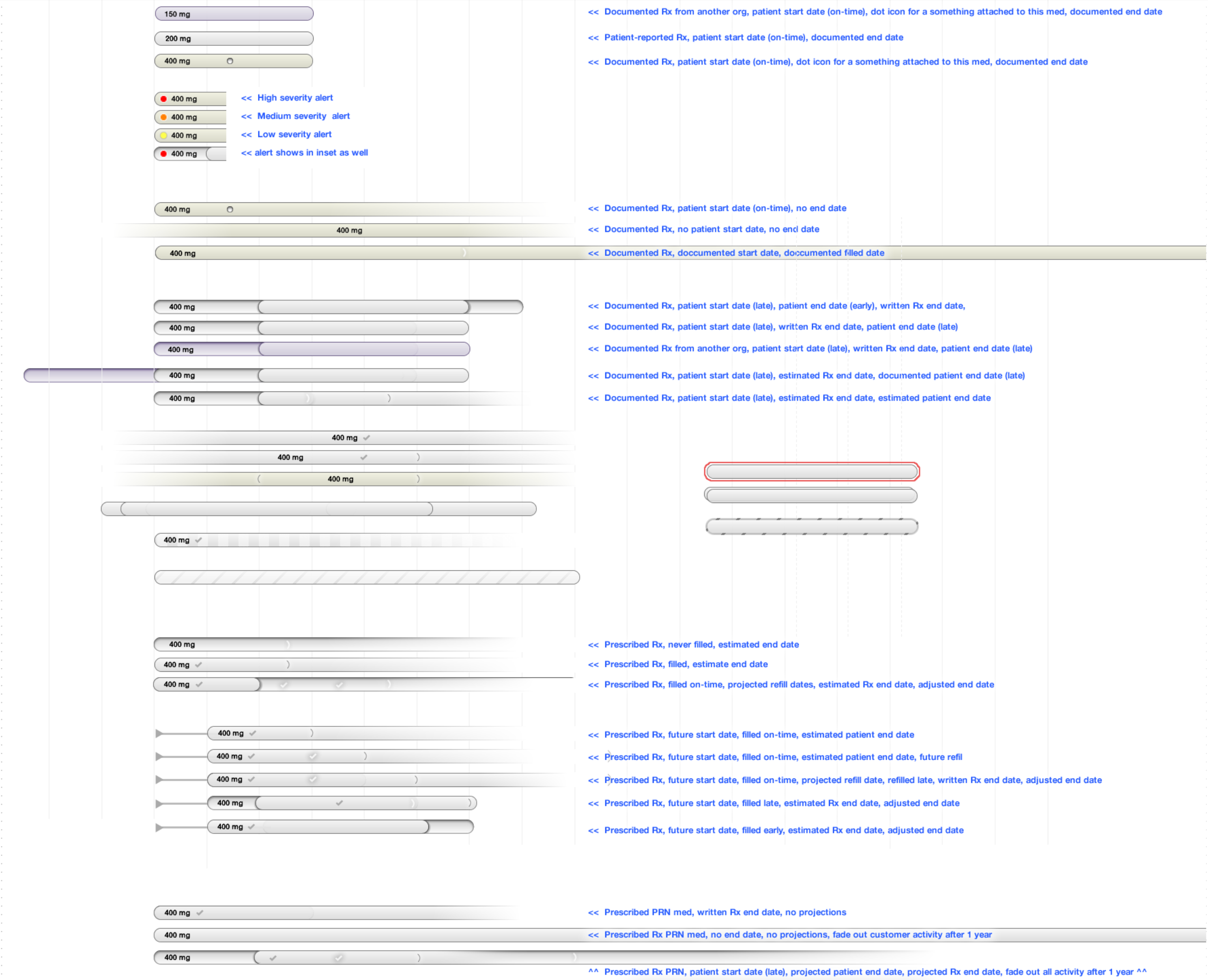
There were 3 more sheets just as complex as this covering even more cases as the doctors kept adding more details and nuances.
I tried to make the skeuomorphic, hyper-data-dense UI work.
It was workable for healthy patients and the CEO was happy…
…but seriously ill
patients have massive, complex medical records spanning over 80+ years which made even the
most elegant UI overwhelming for doctors, who 99% of the time only wanted a summary of
current data.
Swiping through this much data was very slow on even the fastest
tablets with full wifi.
Developers found it exceedingly difficult to render this
many components and variations without crashing the tablet.
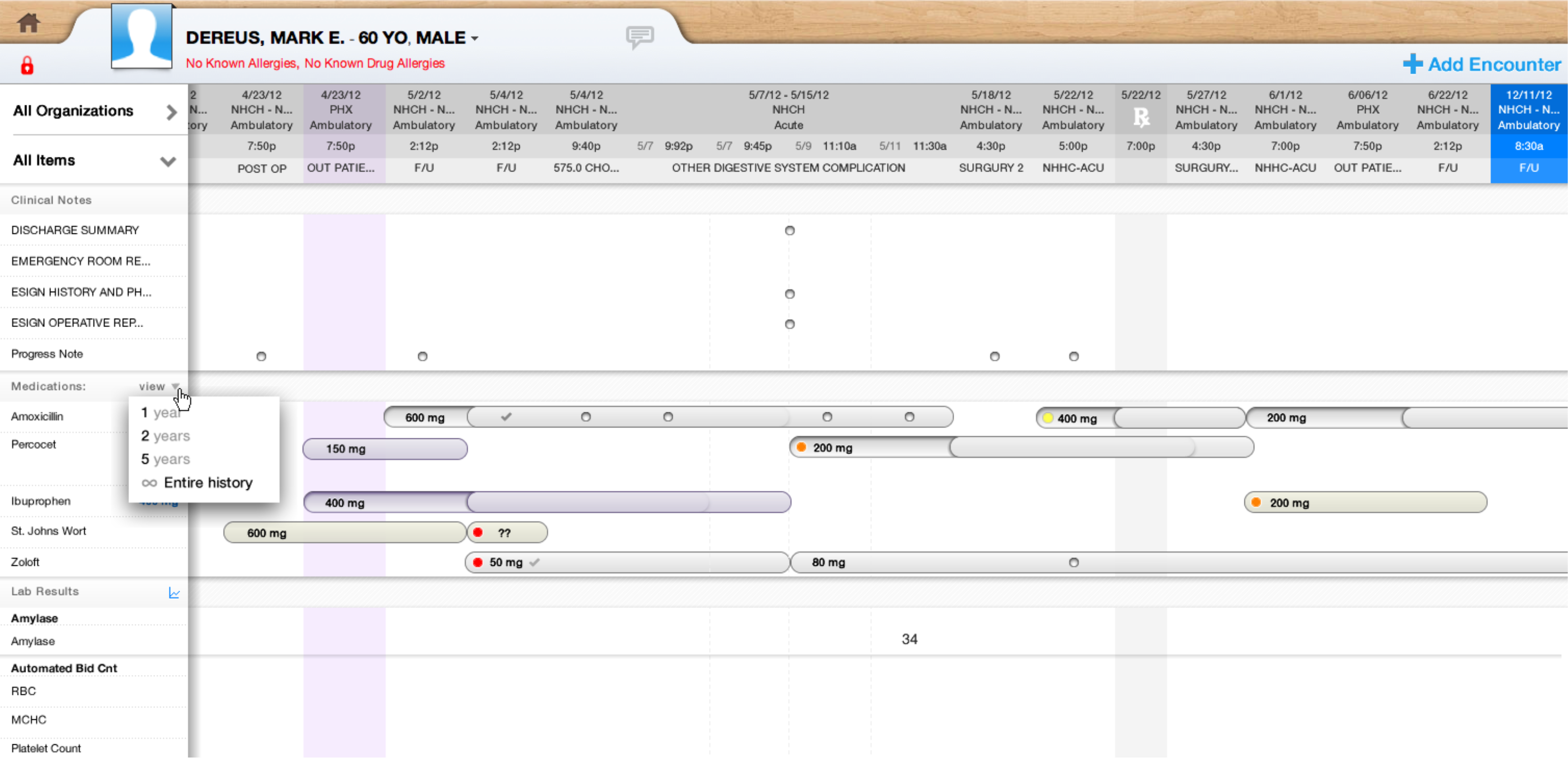
So after many interviews, brainstorms, and reviews, I presented the findings and a new design direction to the CEO and Product Dir. The new direction would flatten the skeuomorphic complexity (solving all the performance issues), reduce the data’s fidelity for more scannable data density (resolving all the clinicians’ concerns) while still allowing them to swipe through vast medical records with ease (preserving the CEO’s original vision).
This also reduced the burden on the Dev / QA teams so
they could proceed more quickly, release more frequently and would allow for more
innovation - all for a fraction of the cost.
The CEO agreed
immediately and presented it to the board, who also approved
immediately.
I created a design system and hired some more
designers.
The UX team proceeded to work on features like e-prescribing,
home-based device integration, advanced clinical date pickers, patient summaries, etc.
and kept testing them all with doctors 3 times per week, every week.
Results
- decrease in data errors (estimated by Dr.’s)
- decrease in data entry time (estimated by Dr.’s)
- increase in Dev efficiency (estimated by Scrum Masters)
- decrease in time to market (estimated by Scrum Masters)
- Dr.’s loved being included and became passionate advocates
- Our app was picked up for a pilot program with the British NHS
Accolades
Visual appeal is irrelevant - just make it brutally clear, lightning fast and simple
Holy cow! That’s vastly better - I’m embarrassed that my software is so much worse - WOW!
I love this! When can we have this?
What do I have to do to get this installed?
When the administration sees this I can’t wait to see their faces!
I can’t thank you enough for including us in this process
Every time we talk I start thinking differently about the software we use and how we could improve it
Growth MindsetWhat I learned:


Continuous Discovery is wonderful - every other day you see your work matter to real people and you know you’re on the right path and so does everyone else in the company. We never needed disruptive pivots, just microscopic course adjustments. All churn faded away quickly and everyone liked coming to work because they know their work mattered.
Working directly with the CEO is crucial for establishing direction, processes and roadmaps so UX can deliver its full value for the business and the users.
Include team leads ASAP in whatever UX process is being established - this breaks down interdepartmental barriers, builds trust and amicability - but be sure to train them before they are thrown into a review session with doctors.
Interviewing doctors is an art - they’ve spent decades honing their calm, authoritative demeanor so they can feel stressed if they don’t know the answer or even when asked creative questions or using unfamiliar nomenclature. This makes it crucial to reinforce that it’s the usability being tested, not their ability. Plus, they are inherently prone to memorization and dexterity with vast medical lexicons so creative brainstorming can be challenging for them so make sure it’s collaborative and fun. Be prepared for lots of biological humor.