

Optimizing Call Centers
Converted furious clients into passionate advocates via inclusive design process, improved ease-of-use for call center workers while restoring the reputation of the company, and stabilizing a troubled team.
High visibility, high priority, high pressure project
Services
Software
Time / Team
- User Research
- UX Strategy
- Stakeholder Management
- Design
- Prototyping
- Usability Testing
- Fireworks
- Axure
- Photoshop
- OmniGraffle
- Confluence
- Camtasia
- 2009-2012
- 1 Product Manager
- 1 BA
- 1 Designer
- 1 Engineer
- 6 Developers
My Tasks
- Redesign an ecommerce call-center application to be more user friendly, vastly more efficient, easier to learn, and cheaper to support
- “Be the catalyst for change on this team” - My Manager
- Improve the morale of a product team left to languish for many years
- Restore the reputation of our company (Art Technology Group) in the eyes of industry analysts and customers including AT&T, Restoration Hardware, J.Jill, Walmart, Costco
- Resolve concerns of potential buyers (Oracle)
My Actions
Researched the “Commerce Service Center” application, the users, and the history of the project from the team leads.
Relationships
The original platform
- Looks circa 1985
- Painful to look at
- Users hated it

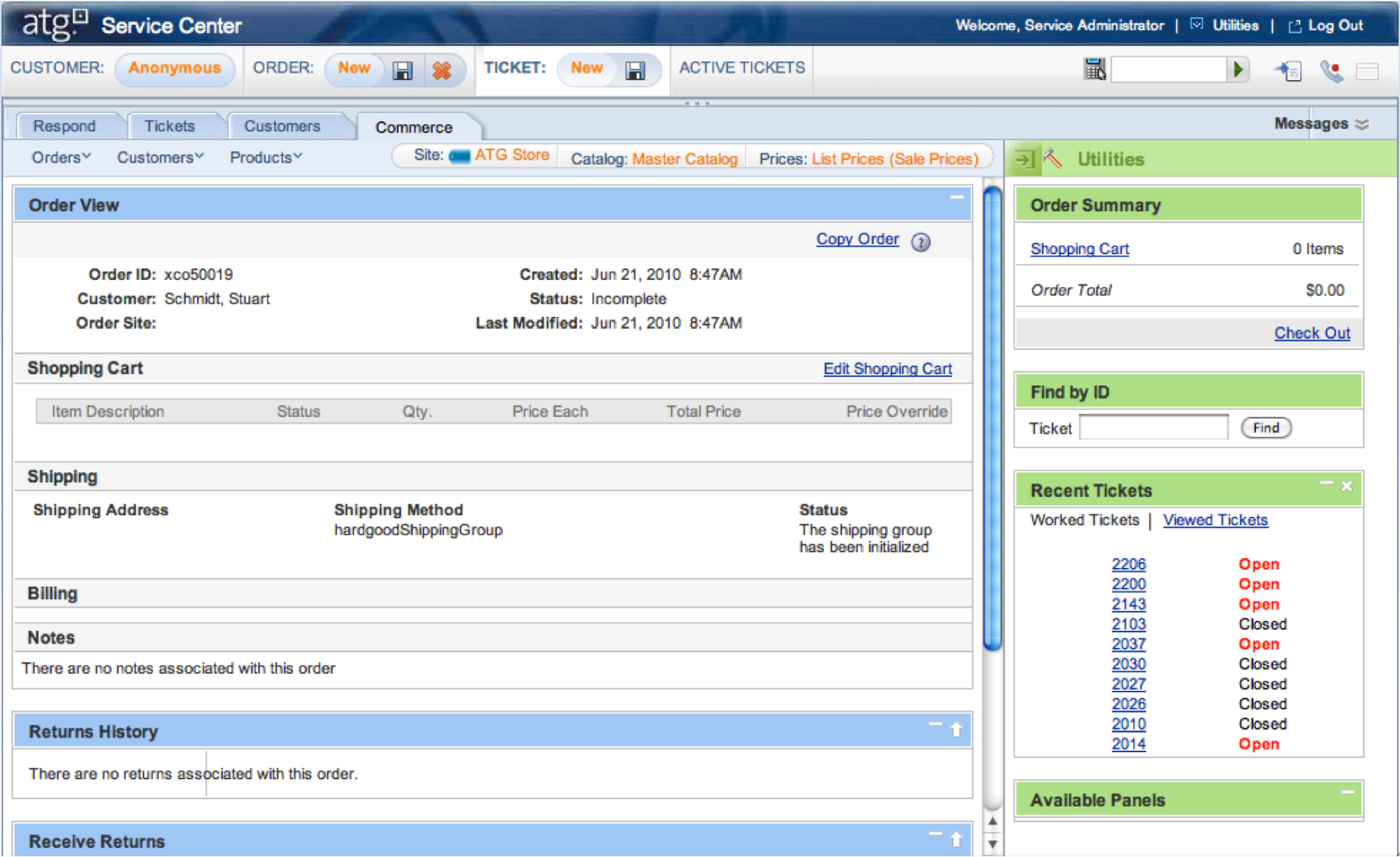
Orange means ??
Copying doesn’t need help
Contextual data, labels, icons, buttons, all jumbled
Tabs occlude key features
Customers inside Commerce tab, Commerce inside Customers tab
63 icons!
Crucial feature
Duplicate feature
7 levels of nested boxes
Unnecessary feature
Bold is over-used
Useless feature
Phantom lines
Blue means ??
Green means ??
The feature set was vast and the learning curve was
9 months.
The visual architecture, UI and workflows were a mess.
The
application sat on top of call-tracking and productivity software used by call centers so
there were myriad integrations to consider.
The application had been built
through acquisition and the original architects were no longer at the company, so no
one knew how it all worked, which made any change a daunting
prospect.
Everyone wanted change in theory, but in practice no one had the skills or
the confidence to know how to proceed.
So…


To get past the team’s fear of failure and change aversion, I suggested we go on site visits to cultivate customer relationships and gain deeper understanding of their pain points, ideas, processes, etc.
Watching call center workers handling angry customers all day, every day, we developed deep empathy for people and renewed commitment to making their lives better.
Now that we’d all witnessed how much users suffered, we all felt an intense commitment to help them. Plus now that we’d seen the patterns behind the problems first hand, the solutions were obvious to everyone.
We learned that customers had been allowed to install and configure everything on their own, with no support or standardization so their numerous hacks and workarounds made every click take 90 seconds to load - when scaled up to millions of calls per month (all while customers were screaming at them) the cost was staggering.
Next Steps:We couldn’t
force them to scrap all their customizations right away, especially since their mistakes were
caused by our not having supported them during the installation process. So we needed some
low hanging fruit to prove the concept and build trust / traction - all without touching
their customizations.
I designed a flattened navigation hierarchy, with all the
contextual searchers universally available at the top level, which would save users from
having to move up and down the hierarchy looking for the search engine they needed, or change
context from one type of call to another.
This model could be applied to Callers,
Tickets, Products, Catalogs, Pricing, Brands, Orders, Articles, Returns -
everything.
I reviewed the model with lead developers and it would be a simple code
change for us and wouldn’t disrupt any of the client’s customizations.


Search
Context
The team, and management, were trepidatious about the new concept, and still concerned about making a mistake in such a high-stakes project. So I redesigned the entire app using this new concept so they could see it in context - which they loved, but they were still apprehensive about moving forward with anything this new.
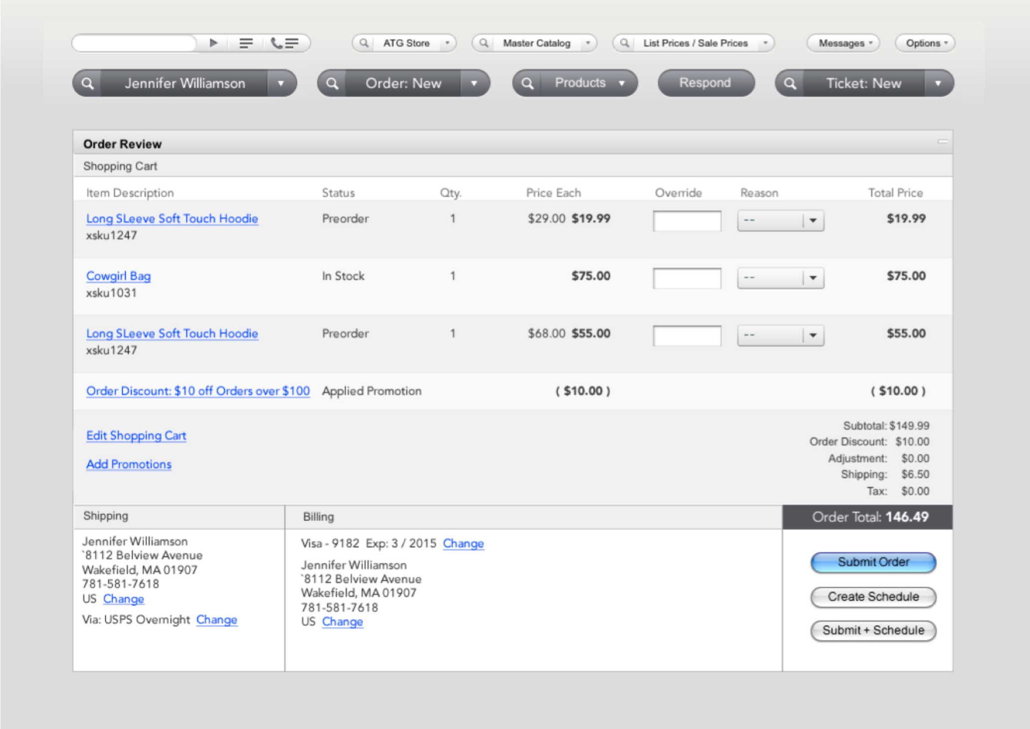
Client / catalog / price switchers
Call mechanisms
Primary tools
Low contrast avoids eye strain
All clutter = gone
Nesting = Gone
Consistent text link colors
Clear visual language
Adaptive context alongside primary buttons
Clearly they needed absolute certainty this would
work and the only way forward was to build a prototype so I could prove the efficacy of this
solution beyond all reasonable doubt.
So I built the prototype and created a usability
test to prove that while the concerns of our team were valid, once the customers started
using the modified tools to handle actual calls, they would conclusively love the application
within 40 minutes.
The test consisted of multiple phases and methodologies to get
their initial impressions, then dive a little deeper, then start using the tools in a context
they were completely familiar with, to see how their impressions might evolve and to avoid
superficial interpretations that come from simplistic stand-alone methodologies.
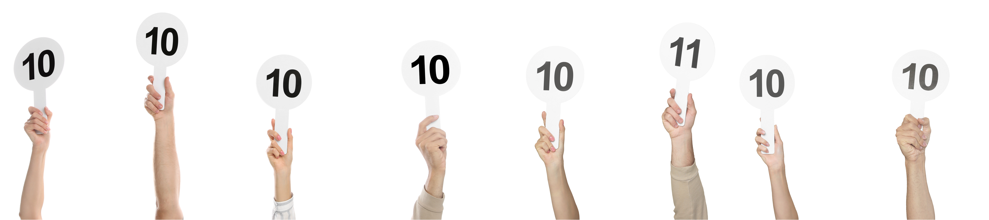
First Impressions
Usage Tests
Scoring
They hated it, but we knew they would because they were deeply entrenched in the familiar (which they also hated). This also convinced our detractors that we were taking their concerns seriously and that we were not biasing the results.
I then let the users take control of the prototype to handle incoming calls from customers with unusually complex issues (which required them to use the new features repeatedly). This showed everyone how quickly they would accept the changes.
I also designed the scoring system for the test to allow the rest of the team to do the scoring and see for themselves how right this path really was.
Results
- reduction in learning curve (estimated by clients)
- reduction in call-times (estimated by clients)
- million in recovered revenue per quarter (estimated by clients)
- to win over change-averse clients
- 36 furious clients became passionate advocates
- 200,000+ users now enjoy their jobs
Plus Oracle’s buyout of ATG hinged on this work so indirectly this project was worth 1 billion dollars
Accolades
Jesse has a wonderful ability to take a lot of disparate actions that a customer needs and transform them into a smooth, simplified flow - that makes you say, "Why didn’t I think of that??". He’s passionate about his work and I very much enjoyed the creativity he added to our project.
I am not kidding. I will pay to fly out with my entire team and barge into your CEO’s office so he knows just how much this means to us. I can’t thank you enough!
Wow! This is going to save us millions!!
Thank you so much for letting us test this by taking calls. I don’t know good design from bad, except when I’m handling difficult people using the application.
I can’t believe I was so stuck in the familiar that I couldn’t see it for what it is right away. This new stuff is amazing! One simple change and everything gets so much easier!
You pulled off a miracle!
Nicely done!
Growth MindsetWhat I learned:


To build trust: first prove detractors are correct before showing them there is more to it - let them see it for themselves.
Impression tests are fast, but letting users try out the tools for themselves in a familiar context yields irrefutable results.
Site visits are a great way to build cohesion and develop morale on a team, plus watching real users work generates deep empathy, renewed commitment and purpose.
ALWAYS be nice to call center workers - they are exceptionally wonderful people doing an unimaginably hard job.
When an under-served community is truly listened to and treated like human beings – the gratitude can be overwhelming.
This project completely changed how and why I design.
Design
would be an act of compassion for the rest of my life.